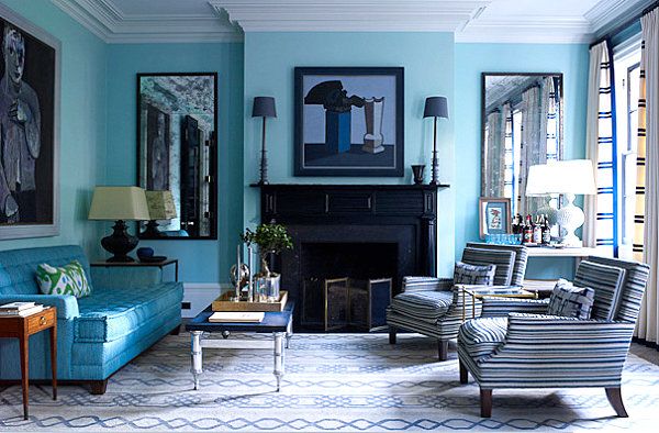
27 Feb Trend alert: Monotone in home interiors
A monotone colour scheme, like the name suggests, uses only one colour, with little variation in value or saturation. That is, lighter and darker variations on the colour are not part of the overall scheme, nor are duller or brighter variations of that colour.
Although monotone in home interiors can feel very gentle and soothing, they also run the risk of giving a home a timid feeling. To ensure a good effect include a second colour (mostly white or black) to your chosen hue, and the effect can be extraordinary.
Below are some examples that use a Monotone in Home Interiors.

Source: www.colourdesign.net.
This is an example of a complete monotone application. The room is designed in rich golden-tan tones with a combination of deep brown and lighter golden tones. Also notice the light stripes on the cushions that add a subtle hint of another colour.

Source: www.pinterest.com
Having grey as a monotone is also touted to be very popular; it calls for a play with different shades of the tone. Depending on the fabric and textures used, this colour scheme will make homes look elegant and cosy.

Source: www.pinterest.com
Designing a room using a monotone colour scheme such as a lime green creates a calming effect. As seen, all the greens in the above image are the same. Also, this works best if the monotony is broken down by a sober colour such as white.

Source: www.pinterest.com
Red as a monotone in home interiors is far from calm or soothing. Yet if the colour scheme is uniform across the interiors, it gives a settling effect. However, this needs to be combined with a sober colour that complements the hue well.

Source: www.pinterest.com
Using a single hue across interiors in different shades and textures is another way to design your interiors using the monotone approach. To avoid monotony, this theme needs to have perfect balance of light and dark hues of the same colour tone without too much variation.
Look at Suraaj’s collection of monotone colored home textiles


